ShopDreamUp AI ArtDreamUp
Deviation Actions


Description
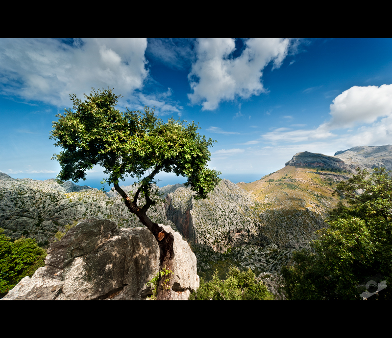
Palma de Mallorca, somewere between Inca and Sa Calobra  (Smile)")
Nikon d80 & Sigma 10-20
© *obojkovski 2008 – 2010
This image is registered and protected by MyFreeCopyright.com. All rights of this image are reserved to *obojkovski aka Ognen Bojkovski and may not be used in ANY way without my written permission. No copying - No redistribution - No unauthorized use. Thank you!</i>
Image size
800x691px 516.04 KB
© 2010 - 2024 Bojkovski
Comments89
Join the community to add your comment. Already a deviant? Log In
There are a lot of great things you have happening with this image, there are also some things that could be tightened up.
Firstly I want to say that your sky is beautiful, excellent gradient, excellent color, very dynamic. The jagged centered horizon line is great, it has enough curve to it not to be static, and leads the eye directly to the tree. The overall placement of elements, tree, sky, horizon, and rock, is good, however your value and hue composition could use some work. Take a look at the beautiful greens in that tree, now compare them to the greens in the bushes. The hue of the bushes is actually stronger than that in the tree. This has to do with the artificially raised contrast of those leaves. That makes the lights very light and the darks very dark, two effects that decrease the overall saturation (high saturation can only really exist in the midtones). Just compare it directly to the bush in the bottom left corner. The tree reads (when squinting your eyes) as a series of darks and lights with a slight green, really olive overlay. The bush reads as a solid patch of green. That these greens all bleed off the page is also not helping you, it keeps pulling the eye from the tree and out of the image.
What is good, however, is the contrast between the trunk of the tree and everything else, and between the tree and the sky. I think you could accent this by brightening up that stone just a touch. To fix the greens of those trees really bring the contrast down, also adjust the overall tone. Off hand I would say go darker, sort of like a very selective vignette.
For the framing, it's okay, but the strength of your image is that it feels like it could be a panorama. I'd say take out the current frame, re-crop your image to 90% of it's current height (and if you cropped out any of the width, get that back in). Then, to further enhance the landscape nature of the piece, frame it with the large border on the sides (rather than on the top and bottom as you have it now) and a thin border on the top and bottom. It should accomplish the feel of the way old plate photography used to be mounted, and really accent the panorama effect.